Archives for


Details, Details – VW Golf

golf rear

Well, look what we have here! One of those cool little auto body design details I was lamenting had become extinct. Moreover, it has an uncanny similarity to my suggestion for the Ford F150. While I doubt I had any influence on the brilliant team in Wolfsburg, the similarity in concept is striking. There is one major difference however. The logo conceals the rear camera which activates while the vehicle is in reverse, not the latch handle like I had suggested for the truck.

Golf-15-0158-Dig-3000x1948


Pretty cool. Another nifty little detail is in that body crease you see on either side of the logo/camera cutout, but I’ll let you research that one yourself.


Images from VW


The Kids First Coupon Book Enters The 21st Century

KFlogo


A few years ago when I first got an iPhone, I had an idea. Wouldn’t it be great if someone could take the fundraising coupon books we all love and use and make them even greater by putting them on our mobile devices? Of course it would! So after doing some research I found some similar programs, but nothing in our lovely town of Chattanooga.


booklet


Read More

“Uncomfortable Design”

WateringCan


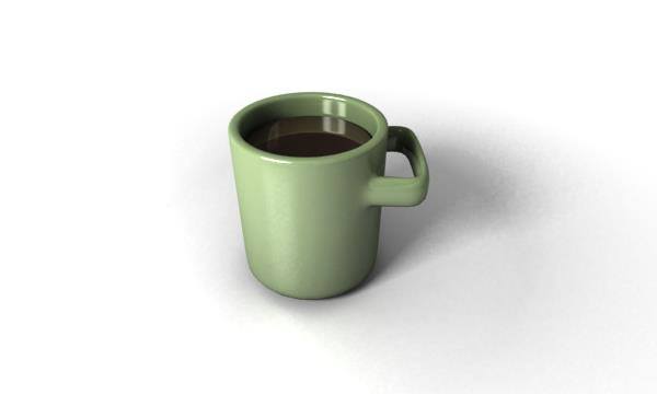
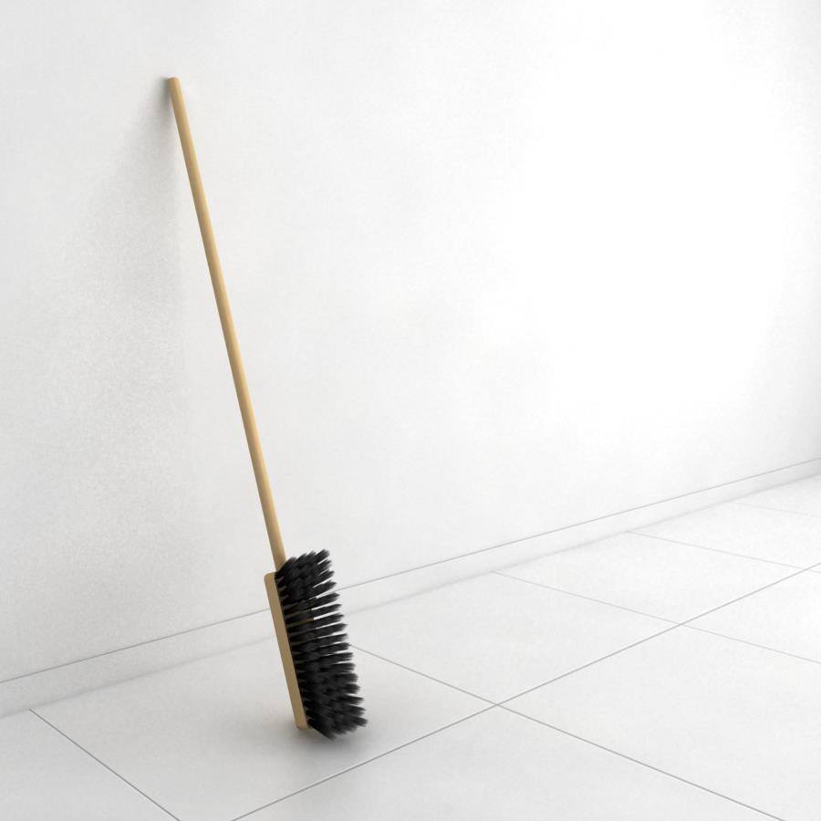
I began following Paris based design group “flashy fish” earlier this year on Facebook. Generally, they have pretty neat stuff, but one of their most recent posts was a series of images by Greece based designer Katerina Kamprani entitled “The Uncomfortable” and it immediately becomes apparent why.


Mug


Shop_brush


Kamprani states: “[I] decided to create and design for all the wrong reasons. Vindictive and nasty? Or a helpful study of everyday objects? The goal is to re- design useful objects making them uncomfortable but usable and maintain the semiotics of the original item.”

Semiotics is such a great way to describe what is going on with these images. If you don’t believe everything we touch is loaded with meaning ingrained deep within our subconscious, maybe this image will help convince you:

Doorhandle

Maybe it’s because I’m a materials guy, but for this rendering in particular, the material and construction are so improbable as to completely negate the objects usefulness. Much like verbal language, materials and products especially, come with layers and layers of nuance and tradition ingrained in every society for roughly eons. Then someone goes and smashes all those things to hell and our brains don’t quite know what to do with what they see. These images do that.

Similar to the works of Tobias WongMilton Glaser or maybe just “The Most Useless Machine Ever“, “The Uncomfortable” can at first glance appear to be playful, ephemeral thoughts that somehow became images. A second look however reveals a deeper message spelled out by deconstructing something that we rarely think about and rearranging it.  We recognize it, but the reorganization sends us a different message than we are used to hearing. They’re like visual anagrams that also happen to be double entendres. The minimalism of the compositions just reenforce their message. “The Uncomfortable” also has a Facebook page with uncomfortable findings beyond Katerina’s own work.


How I fixed my 1990 BMW marker light

I broke the clip slot on the driver’s side marker light of Isis (my 1990 BMW 325is), and I didn’t want to buy a whole new assembly ($32+ shipping). So, I modeled the broken portion of the assembly from the passengers side clip which is still in tact and 3D printed it.

I removed both assemblies, and measured the passenger’s side assembly with a cheap gauge and guesstimated what I couldn’t measure. I modeled the section in Autodesk Fusion for Mac and uploaded the model to Shapeways.

IMG_4647

Read More

Details, Details – Ford F150

This being far and away the most popular image on my Facebook page, I am going to start with it.

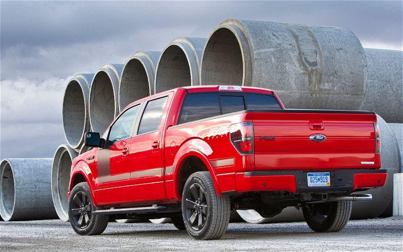
What happened to all the cool little auto body details? The ones like a gas filler cap behind a tail light? Or… OK there have to be some others, I just can’t think of them right now. I was calling this “If SEIZMIC design had anything to do with it”, but I think I’m going to start calling it “Details, Details”. Way easier. In these posts I will seek to rectify, with Photoshop, what I consider to be glaringly obvious auto body styling oversights. Things that are so obviously out of whack they make me actually facepalm when I see them driving down the road… Actually, when they are in a parking lot. Facepalming while driving is just dangerous. So here we go; first installment:

Ford F150

Images via Motor Trend

2012-ford-f-150-rear-three-quarters

So here we have the enduring Ford F150. Big, strong, rugged, what’s not to love right? While cool little body details might not exactly be the typical realm of proper trucks, This model has such nice, clean lines, there is one little detail that just strikes me as so completely obvious… Just so completely, insanely obvious… So utterly, bafflingly, well, just look:

2012-ford-f-150-logo handle

There, much better! Was that so hard? It would probably even SAVE Ford money. Now what’s not to love?

More to come!


Old Logos

I’ve done quite a few logos over the years. I’ll probably do a bunch more. I’m going to go ahead and dump a bunch of the better ones into this big logo post, but as they filter in, I’ll create new posts for those. So here they are, somewhat in chronological order. Enjoy!

CRFC Lion K-01

Chattanooga Rugby Football Club Hired me to design a new, eye-catching logo for their image revamp a couple years ago. Use of the logo is still being debated.

Read More

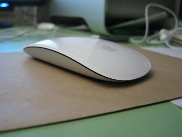
What’s So Magic About Apple’s MagicMouse?

Apple MagicMouse

NOTE: This is a review I wrote about three years ago and posted on my Facebook page. I’m posting it here to get the hang of WordPress.

I was fortunate enough to have started using Macs just when their infamous “hockey pucks” were being phased out, so I was spared the living nightmare that was having to use this torture device on a day to day basis. No, I was familiarized first with the clear lozenge mouse during my first year in graphic design. Getting used to the one button school of thought wasn’t that big of a deal since I had not really used computers much to begin with, and I soon grew accustomed to working in that manner, besides, they looked pretty cool too. Then I got a Mac of my own; a dusty 7600. Yes, a relic of the beige days, which included a beige keyboard and naturally, a beige mouse. Oh, well I was a student, and while it wasn’t pretty, it did do the job I needed it to do just the same as the pretty one. After a few years, the relic was beginning to show it’s age, and I graduated back to a clear lozenge which did not survive the G4 it was paired with. Enter Logitech. It didn’t take long for me to realize what all the fuss was about these “extra” buttons. Especially scrolling. Now obviously, I had used mice from the other side of the PC world, but not having an extra button or so wasn’t a deal breaker. I have to say though, I was a little intrigued when Apple started shipping the Mighty Mouse TM? Oh boy did that look nifty, all with it’s invisible buttons and mini track ball. In the mean time I was certainly enjoying the wireless Logitech. It wasn’t until the G4 sadly saw it’s last project and I had to break down and get a new machine that I actually got to experience how mighty the (not so) new Apple mouse was. Mighty finicky. The delicate track ball was clogged after a couple months, and the touch zones proved to have a steeper learning curve than I had anticipated. All in all it was a needlessly complex device for what it actually did.

I know, it seems like a review of Apple mice past, but one has to see where we Apple users have been to truly appreciate where we are. So here I was Longing after yet another Apple mouse with an abysmally mediocre ancestry. Was I crazy? It looked even more complex than it’s replacement while offering seemingly fewer features. How could this be? Why would a device with such seemingly limitless possibilities be so… limited? Well, as the saying goes, there’s an app for that.

The instant I saw MagicPrefs I needed MagicMouse. But WHY? Why would Apple not give us this functionality built in with OSX? Was it a “Oh well, we’ll do that later” or more of a ”Bah! they don’t need all those friggin options!!” type of thing? Nobody knows the reasons Apple chooses to do the things it does, but I have the suspicion that with the advent of the iPhone Apple has figured out that sometimes it’s just easier to build a swimming pool and a diving board and let others fill it with water and dive in. I was like a little school boy on his birthday when the hermetically packaged sliver of aluminum and polycarbonate arrived for, er, my birthday. Like all apple hand held products It looked like it was supposed have been shipped to a museum and never leave it’s clear box but go straight on display. The Magic Mouse ships with charged batteries. Probably, not so much so that it is ready to use as soon as it’s in your hands, although that is part of it, but rather so it feels as heavy as it looks.

With MagicPrefs installed (there is a similar software called Better Touch Tool) The learning curve is indeed much steeper than without – maybe another reason Apple decided against advanced functionality. In the case of the Mighty Mouse TM? I got very used to the ability to use expose and spaces directly from the mouse. If you’ve never experienced these OSX functions they are incredibly handy workflow speeder-uppers. The problem was that while clever, every time I squeezed the “fourth button” it felt like the mouse was just one squeeze closer to its demise. Thankfully, the awkward squeezing and jam-prone track ball have been eliminated in favor of one solid touch surface. Again. Apple is a funny company when it comes to Industrial Design. They have come such a long way from the one button days, yet, really, there is still only one physical button! Oh, Mr. Ive you sly bastard you. Do you really hate buttons as much as Steve? And with MagicPrefs, there are now about two dozen “buttons” or gestures, including clicking, tapping, pinching and dragging. About twenty options can be applied, and if that’s not enough for you, a gesture can be customized. As noted before, there is a bit of a learning curve, but a little time invested in setting up your preferences can not only save you time during work and recreation on your Mac, but might even get you using some functions of OSX you never even knew existed. Once again, Apple’s method for providing sophisticated piece of hardware and declaring open season for software developers proved to be a magic formula.


“This Is Not Barcelona”

Fabric-Formed Concrete Structures

Heavy Light – Fabric-Formed Concrete Structures by Mark West


Fabric-Formed Concrete Structures2

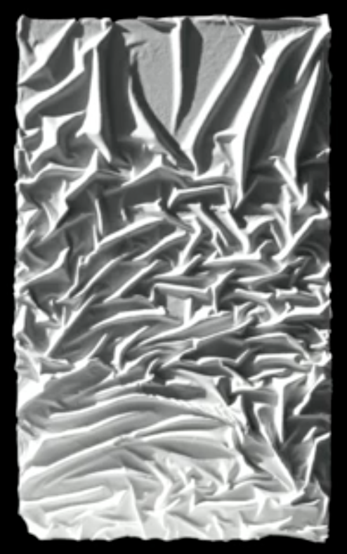
It is a dream of mine to someday build my own house, but one thing that has always bothered me about architecture of all types, and certainly residential architecture, is how overwhelmingly rectilinear it all is. I especially have a soft spot for concrete because I know how flexible it is. The only problem is that flexibility comes at a price. Unless maybe, you get creative. Prof. Mark West, the founding Director of the acronymically ironic CAST (Centre for Architectural Structures and Technology) at the University of Manitoba, has been experimenting with inexpensive techniques for making concrete more interesting while at the same time getting more structural integrity out of less concrete. You’ll have to set aside about an hour to watch the entire presentation, but Mark and his students and teams have developed some very interesting techniques with even more interesting results.